
Designing Dunzo's delivery services
data vis
iterating
interface design
As members of the Partner Design Team, our task was to bridge the gap between conceptual intent and tangible app screens by designing an intuitive card flow that effectively communicates incentive details and MBG earnings.
Designing the Optimal Card Flow for Effective Communication of Incentives and Minimum Business Guarantee (MBG) Earnings within the Partner App
Goal & Business Impact 🚀
23.7% Increase in partner earnings through incentives, altough there was a sudden drop in numbers reported later
There was a reported increase in partner delivery pick ups
34.5% increase in page scroll depth on incentive cards
I don't have access to the real-time current specific data according to the current market scenario. These numbers can change over time due to various factors and would require ongoing monitoring and analysis.
📠 Context
Introduction of a new delivery system with revamped incentivisation methods.
Clear motivations outlined for these system changes were provided.
Goal:
Enhance partner engagement by presenting incentive and MBG earnings information effectively.
Bridge the gap between conceptual goals and app UI for improved user experience.
Types of incentives:
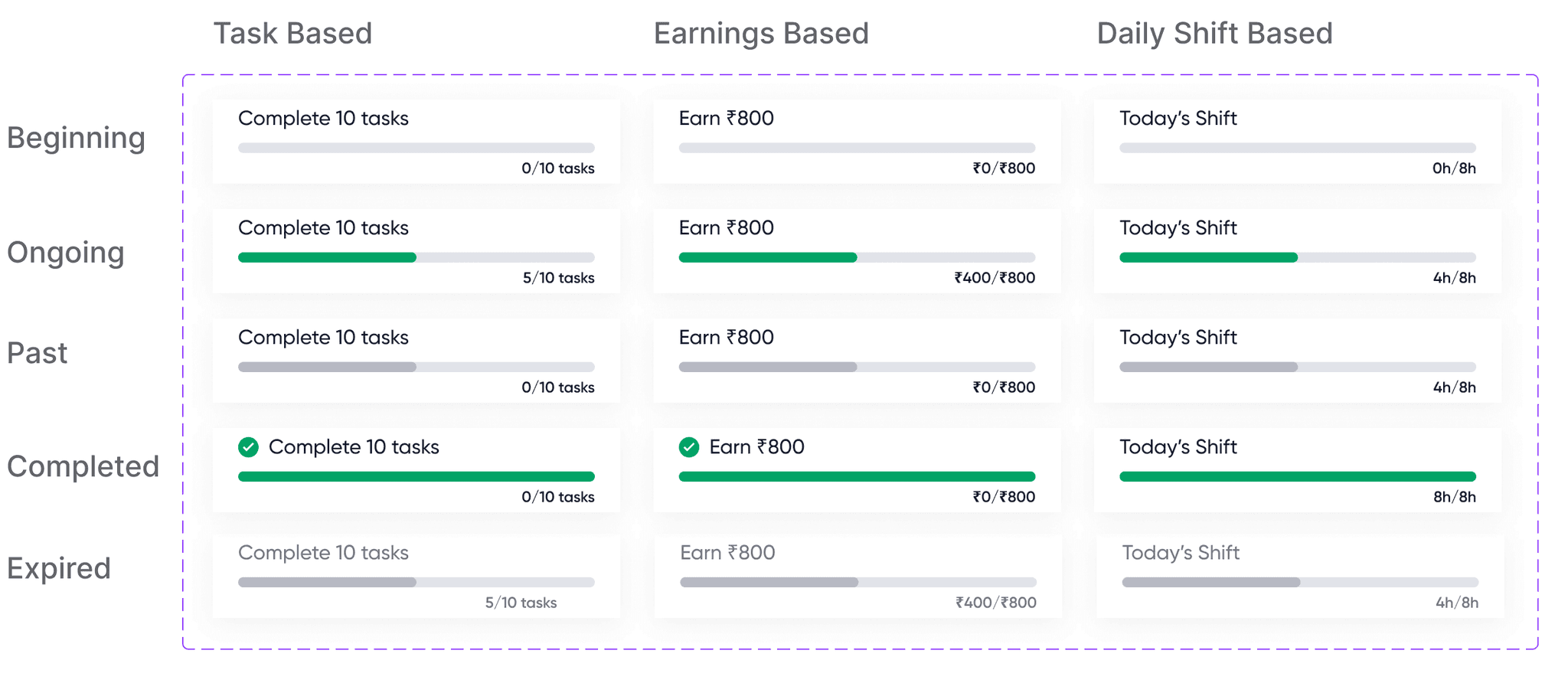
Card categories were provided beforehand to with specific information breakdown for diverse card types. There is daily, weekly and monthly tracking of each incentive with varied stages in progress with granular insight into incentive performance states.

🔬 User flow
Each dashboard card type associated with specific tags and conditions. Themes linked to incentives, timeline types, or card states. A bottom sheet is opened to get more details of the milestones. When a partner satisfies all card conditions it shows a success card.

🔨 Design explorations
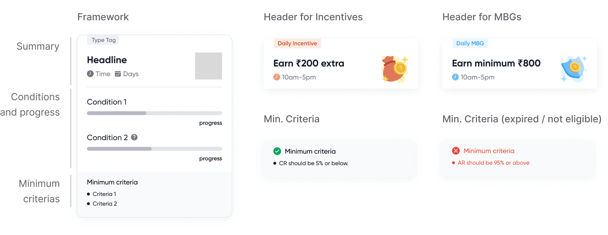
Card on the dashboard:
The card structure was divided into 3 interchangeable segments to facilitate seamless thematic coherence.
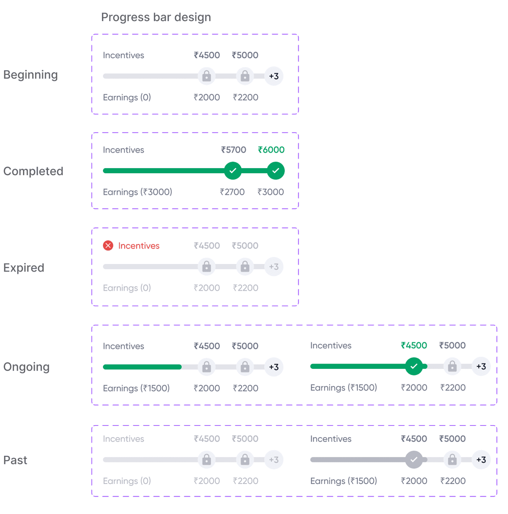
Progress bar:
Highlighting conditions and progress posed challenges. Two distinct progress bar were to be designed, each having different states: Ongoing, yet to start, earned, expired, etc.
Similar design approach for various other conditions (daily, weekly, and monthly shifts).
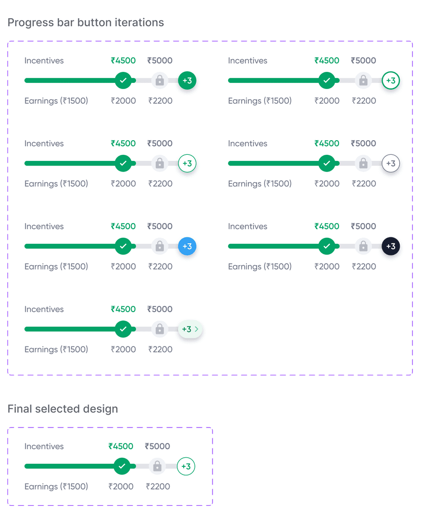
Milestone integrated progress bar with expandable button feature was to be designed. The milestones were aligned with the conditions with visual representation of progress stages. Button to unveil incentive condition details and partner's progress. Main focus when iterating was on clarity, accessibility and intuitive interaction.
Note: Diagrams illustrating the progress bar and button iterations can be provided upon request.
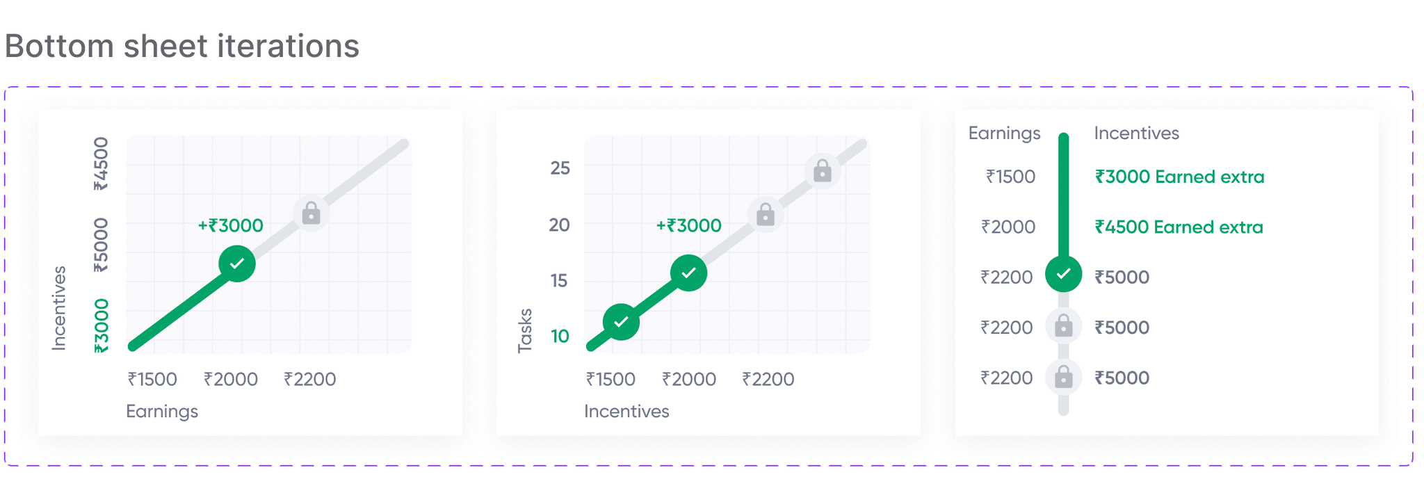
Bottom sheets for complete milestone view:
Clicking the button reveals a detailed bottom sheet which shows a comprehensive progress of the delivery partner. Graphs for showing the progress was designed with focus on visual simplicity and user-friendly presentation. The final version prioritises clear data depiction.
Note: Visual examples of the iterations can be provided on request for better understanding.
Final iterations of the cards with header:
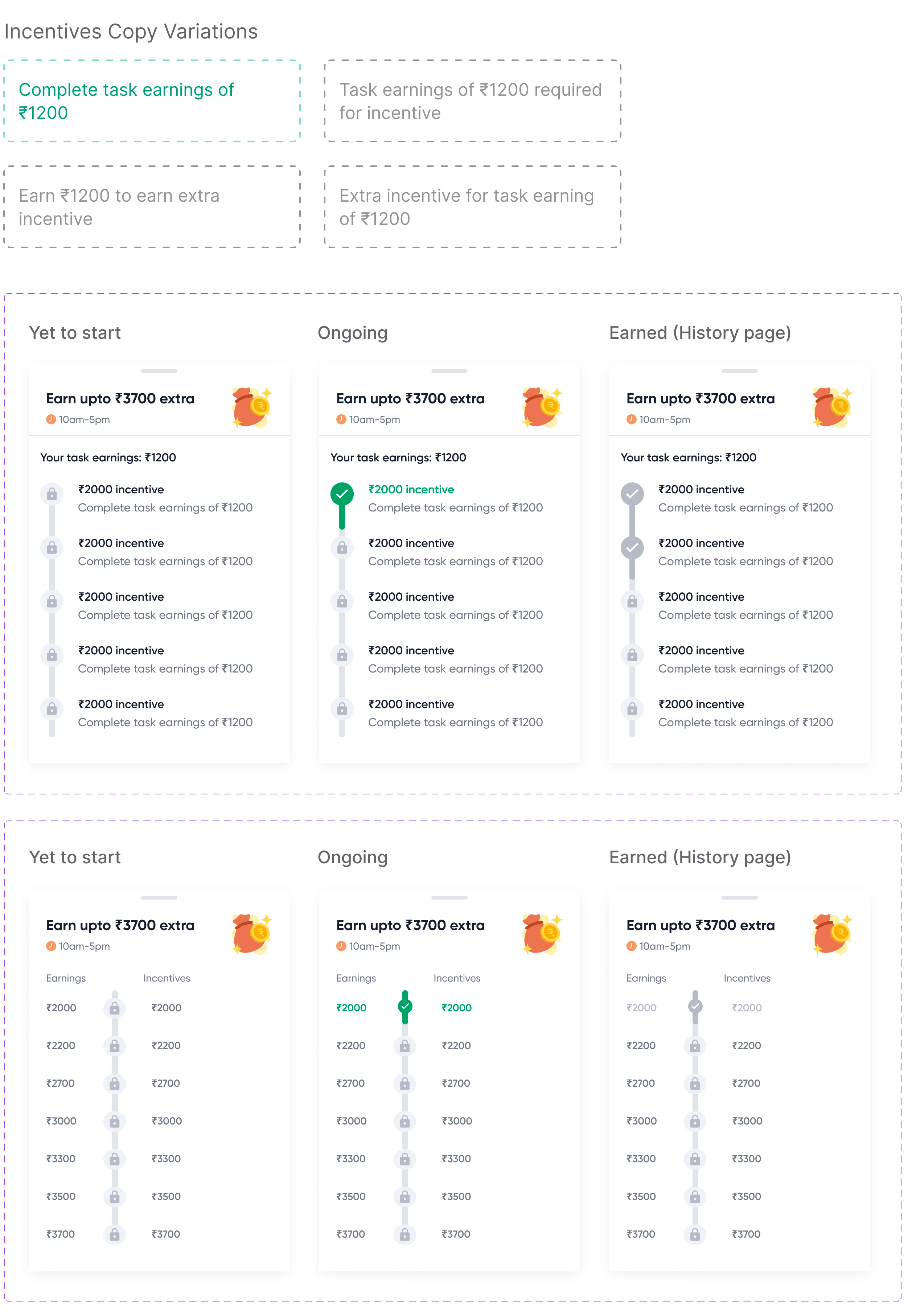
Bottom sheet flow:

Success screens:
Diverse success cards for varied card categories tailored to match the context and purpose. Reflects partner's achievement and rewards in a clear format.
Note: Visual representation of the success card can be shared upon request to provide a concrete understanding.

🎉 Success metrics
Increase in partner earnings through incentives
Increase in partner delivery pick ups
Page scroll depth on incentive cards
Designing Dunzo's delivery services
data vis
iterating
interface design
As members of the Partner Design Team, our task was to bridge the gap between conceptual intent and tangible app screens by designing an intuitive card flow that effectively communicates incentive details and MBG earnings.
Designing the Optimal Card Flow for Effective Communication of Incentives and Minimum Business Guarantee (MBG) Earnings within the Partner App
Goal & Business Impact 🚀
23.7% Increase in partner earnings through incentives, altough there was a sudden drop in numbers reported later
There was a reported increase in partner delivery pick ups
34.5% increase in page scroll depth on incentive cards
I don't have access to the real-time current specific data according to the current market scenario. These numbers can change over time due to various factors and would require ongoing monitoring and analysis.
📠 Context
Introduction of a new delivery system with revamped incentivisation methods.
Clear motivations outlined for these system changes were provided.
Goal:
Enhance partner engagement by presenting incentive and MBG earnings information effectively.
Bridge the gap between conceptual goals and app UI for improved user experience.
Types of incentives:
Card categories were provided beforehand to with specific information breakdown for diverse card types. There is daily, weekly and monthly tracking of each incentive with varied stages in progress with granular insight into incentive performance states.
🔬 User flow
Each dashboard card type associated with specific tags and conditions. Themes linked to incentives, timeline types, or card states. A bottom sheet is opened to get more details of the milestones. When a partner satisfies all card conditions it shows a success card.
🔨 Design explorations
Card on the dashboard:
The card structure was divided into 3 interchangeable segments to facilitate seamless thematic coherence.
Progress bar:
Highlighting conditions and progress posed challenges. Two distinct progress bar were to be designed, each having different states: Ongoing, yet to start, earned, expired, etc.
Similar design approach for various other conditions (daily, weekly, and monthly shifts).
Milestone integrated progress bar with expandable button feature was to be designed. The milestones were aligned with the conditions with visual representation of progress stages. Button to unveil incentive condition details and partner's progress. Main focus when iterating was on clarity, accessibility and intuitive interaction.
Note: Diagrams illustrating the progress bar and button iterations can be provided upon request.
Bottom sheets for complete milestone view:
Clicking the button reveals a detailed bottom sheet which shows a comprehensive progress of the delivery partner. Graphs for showing the progress was designed with focus on visual simplicity and user-friendly presentation. The final version prioritises clear data depiction.
Note: Visual examples of the iterations can be provided on request for better understanding.
Final iterations of the cards with header:
Bottom sheet flow:
Success screens:
Diverse success cards for varied card categories tailored to match the context and purpose. Reflects partner's achievement and rewards in a clear format.
Note: Visual representation of the success card can be shared upon request to provide a concrete understanding.
🎉 Success metrics
Increase in partner earnings through incentives
Increase in partner delivery pick ups
Page scroll depth on incentive cards


स्व
st
{swast}
स्व
st
{swast}
स्व
st
{swast}