


Goodreads re-design
research
ideation
user centric design
I love books. And have been using Goodreads for over 2 years now. My inner designer could not ignore the prospects of improvement in the application. With a couple of additional features and inspirations, this project stands close to my heart.
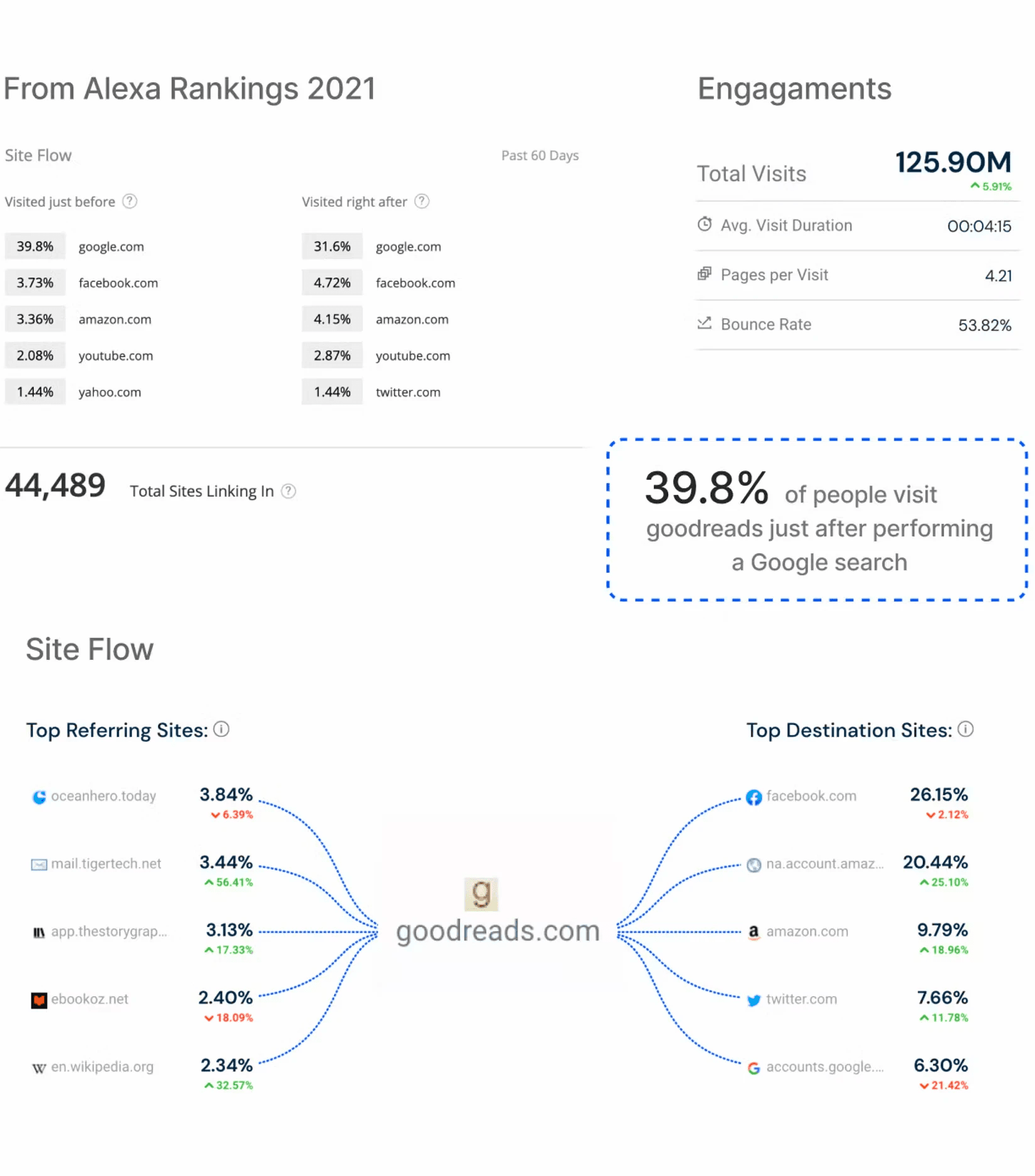
Goodreads provides readers a reading community. Acquired by Amazon in the year 2013, Goodreads holds the highest power of search engine optimisation. Apparently, amazon decided not to upset their user by not changing the design since.
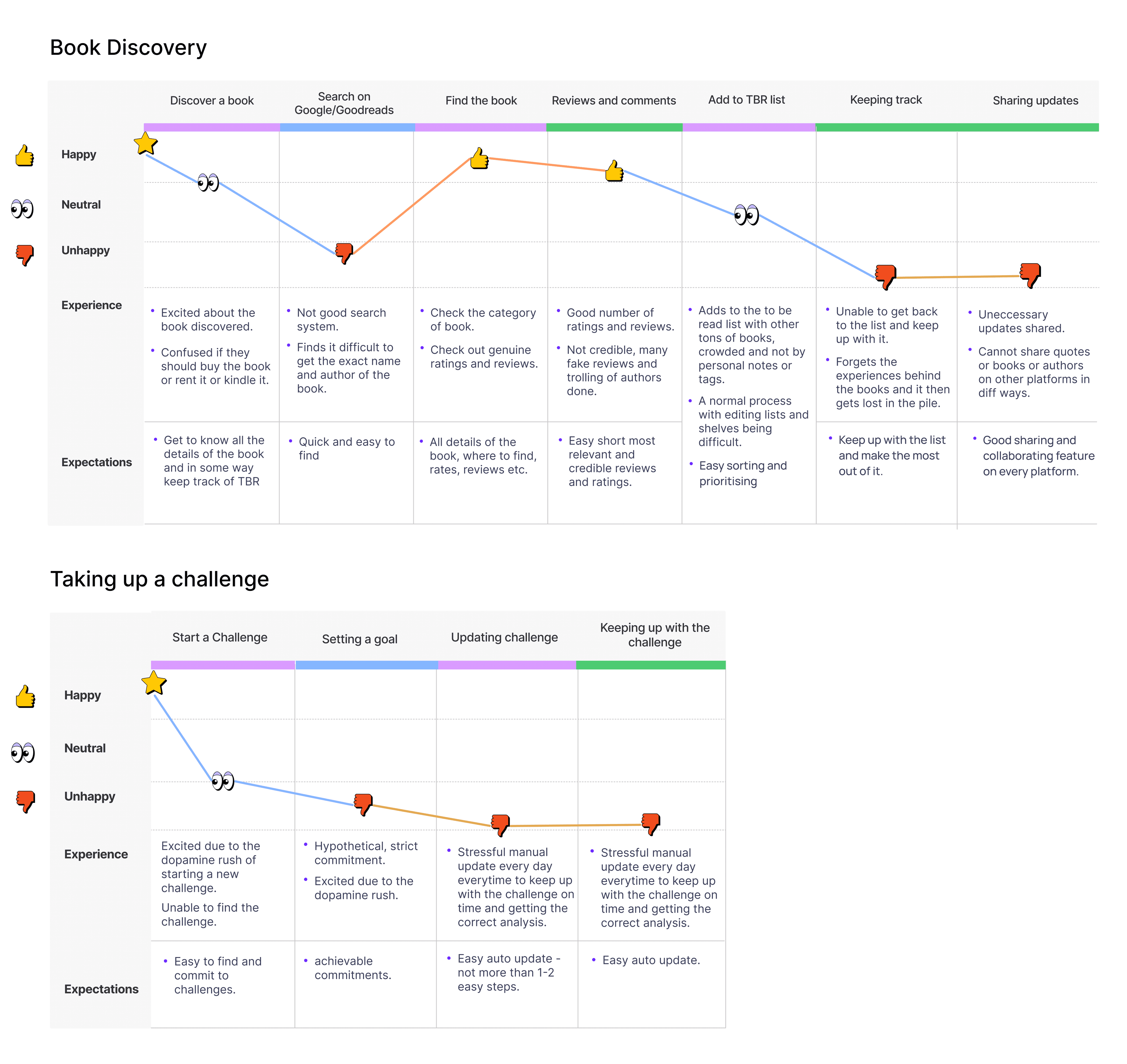
The Problem - The inability to track book reading effectively, adding notes and maintaining tbr and other lists.
Making the Goodreads app a better book cataloging platform.


Goal & Business Impact 🚀
$350 million+ Total combined profit before consolidation when Goodreads, Audible and Amazon books all build an ecosystem
After consolidation, cross-promotion and bundled offerings could lead to a 20% increase in customer spending across the integrated services
With these assumptions, the total combined profit after consolidation could increase 15%
However, it's important to emphasize that this is a highly simplified and hypothetical calculation. Real-world results would depend on numerous variables, a thorough financial analysis and market research would be necessary for a more accurate prediction.
🔍 Initial Research
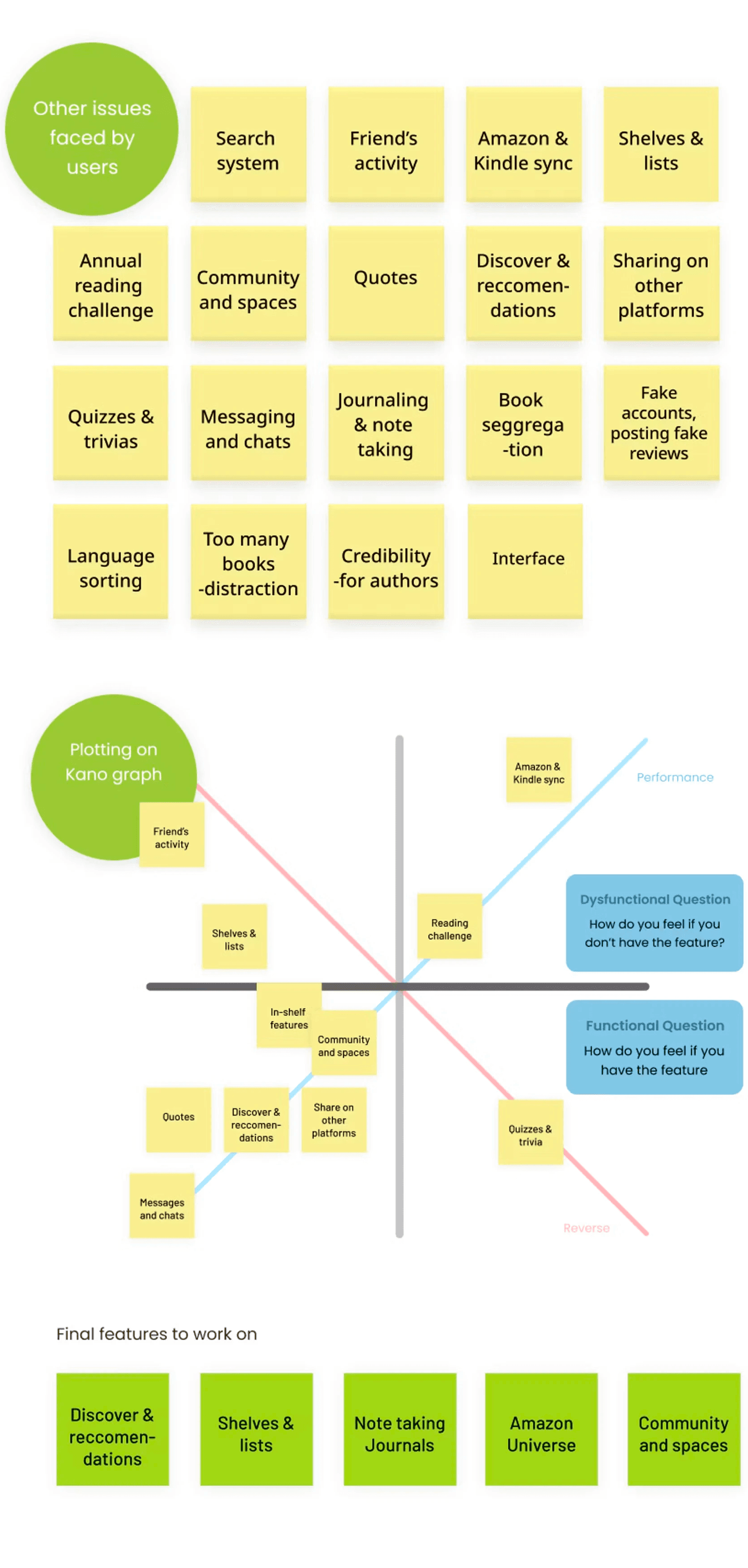
Some common design issues on the Goodreads app include cluttered and confusing navigation, outdated visual design, and inconsistent user interface elements across different platforms. Users have also reported difficulty with the search function and customisation options. Furthermore, book recommendations lack personalisation, making it challenging for users to discover new books relevant to their interests. Finally, some users have experienced stability and performance issues, such as slow load times and occasional crashes.
HMW improve the book-cataloging experience for readers
Collecting all the problems, and finally clubbing them together to map them out on the graph finding all sorts of problems from the app. My basic process was to list down the issues, plot them on the kano graph and prioritise and club all the important issues.
🔍 Qualitative Research
Prioritising user privacy and obtaining informed consent when conducting research was done. Goodreads also has its own terms of service and community guidelines that were respected throughout the research process. Participants were recruited with diverse behaviours in usage of Goodreads and book reading habits to get different perspectives.
User journey analysis: Two flows were read in detail to understand what a user goes through while using this app. This analysis was done with the help of research participants and their journey through the app.
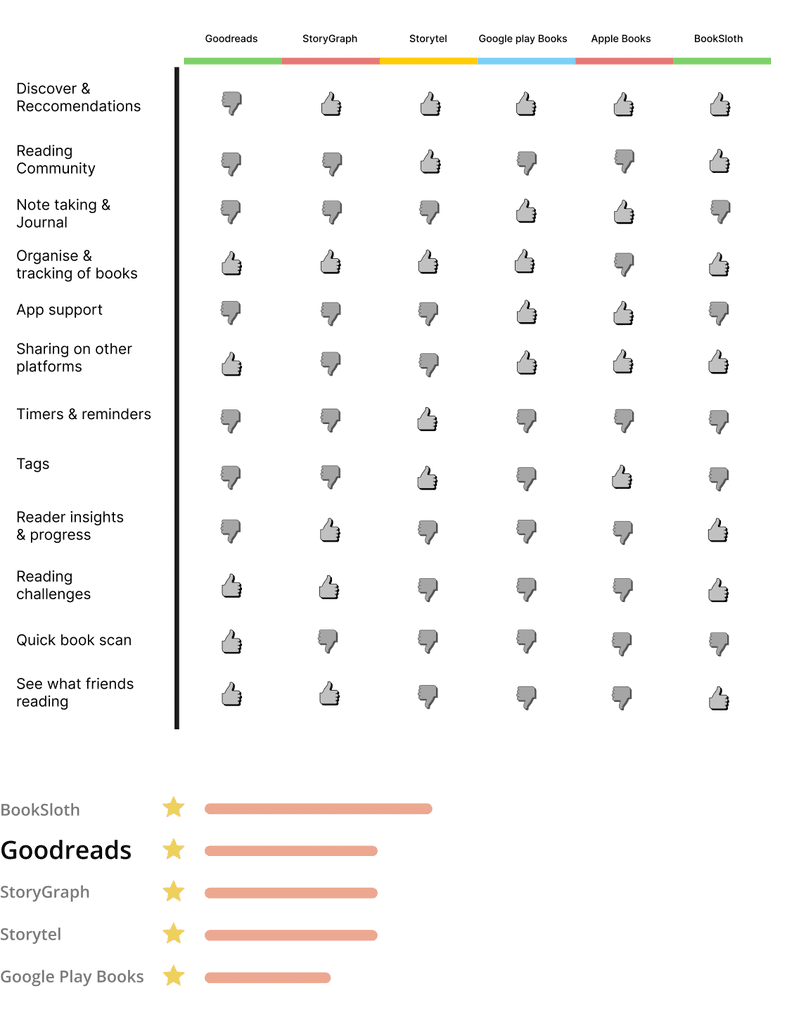
Competitive analysis: To understand the market position of our app, even though Goodreads has the power of SEO, there are certain features which is offered by its competitors.
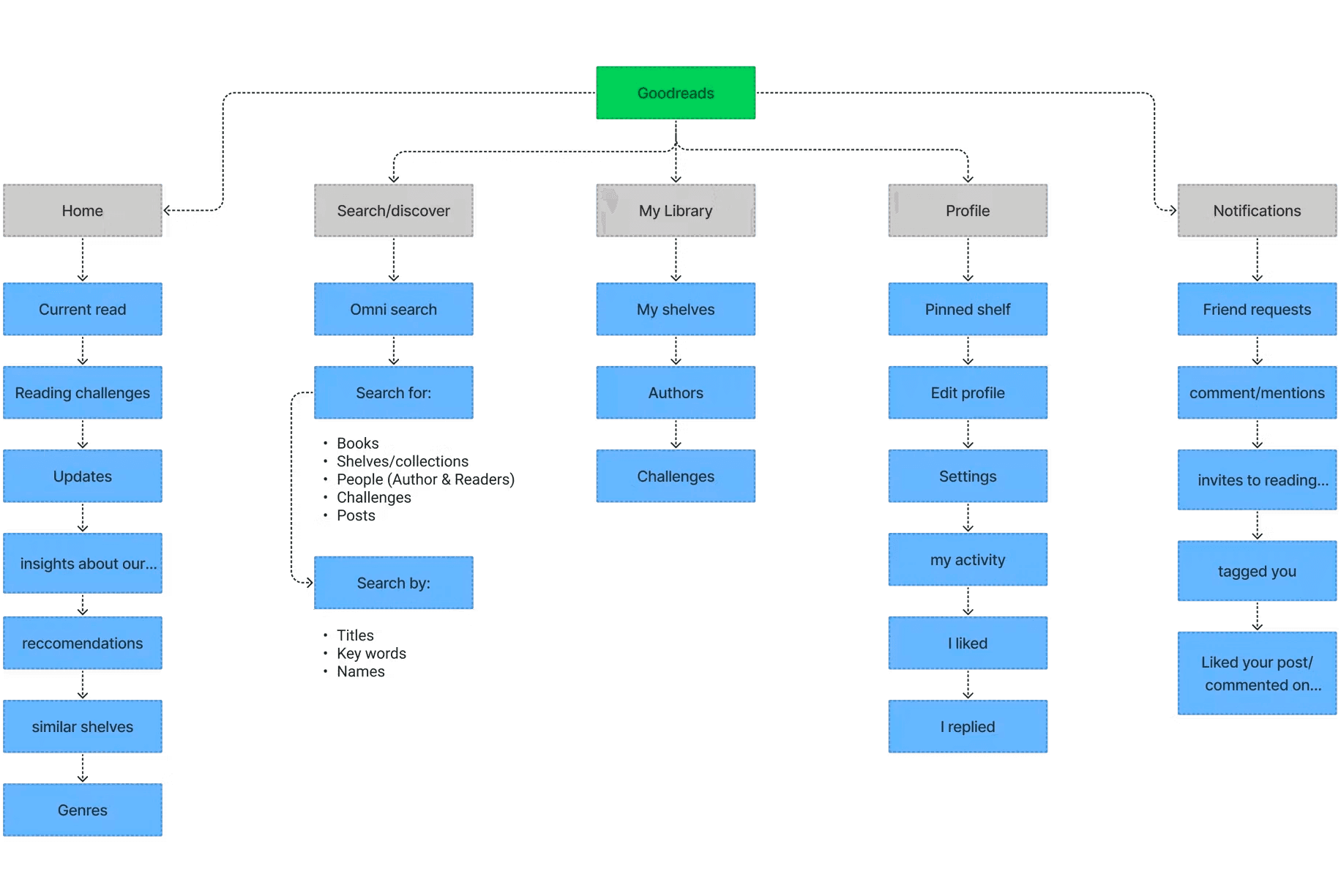
🔬 Information Architecture
After getting a basic idea of the issues to be solved and the target audience, a basic skeleton of the application was created. This did not include the new features to be added, as through this we could get a clear idea on where to add them.
🔨 Explorations
Inspirations and examples were taken from existing apps and their designs. For example, personalised recommendations and discovery is uniquely provided by Spotify. They use silent data to learn a user's choices. This is explained in one of their research blogs on Human Computer Interaction. Other features on spaces like Twitter and Clubhouse helped communities stay intact even during the pandemic. This could also have been a good addition to the app.
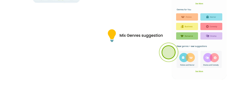
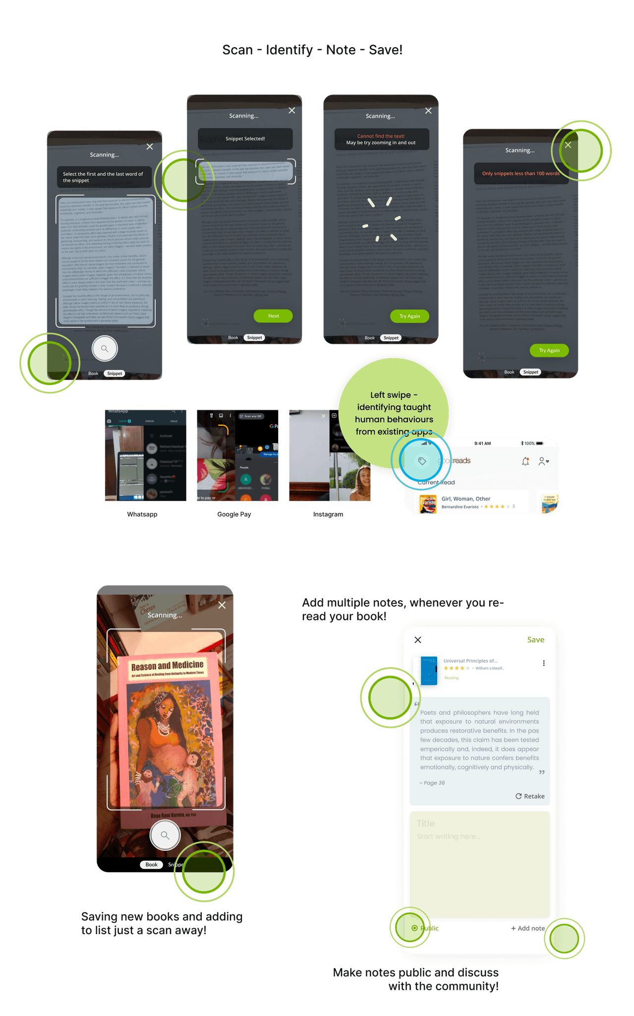
🎡 New feature: Snippets!
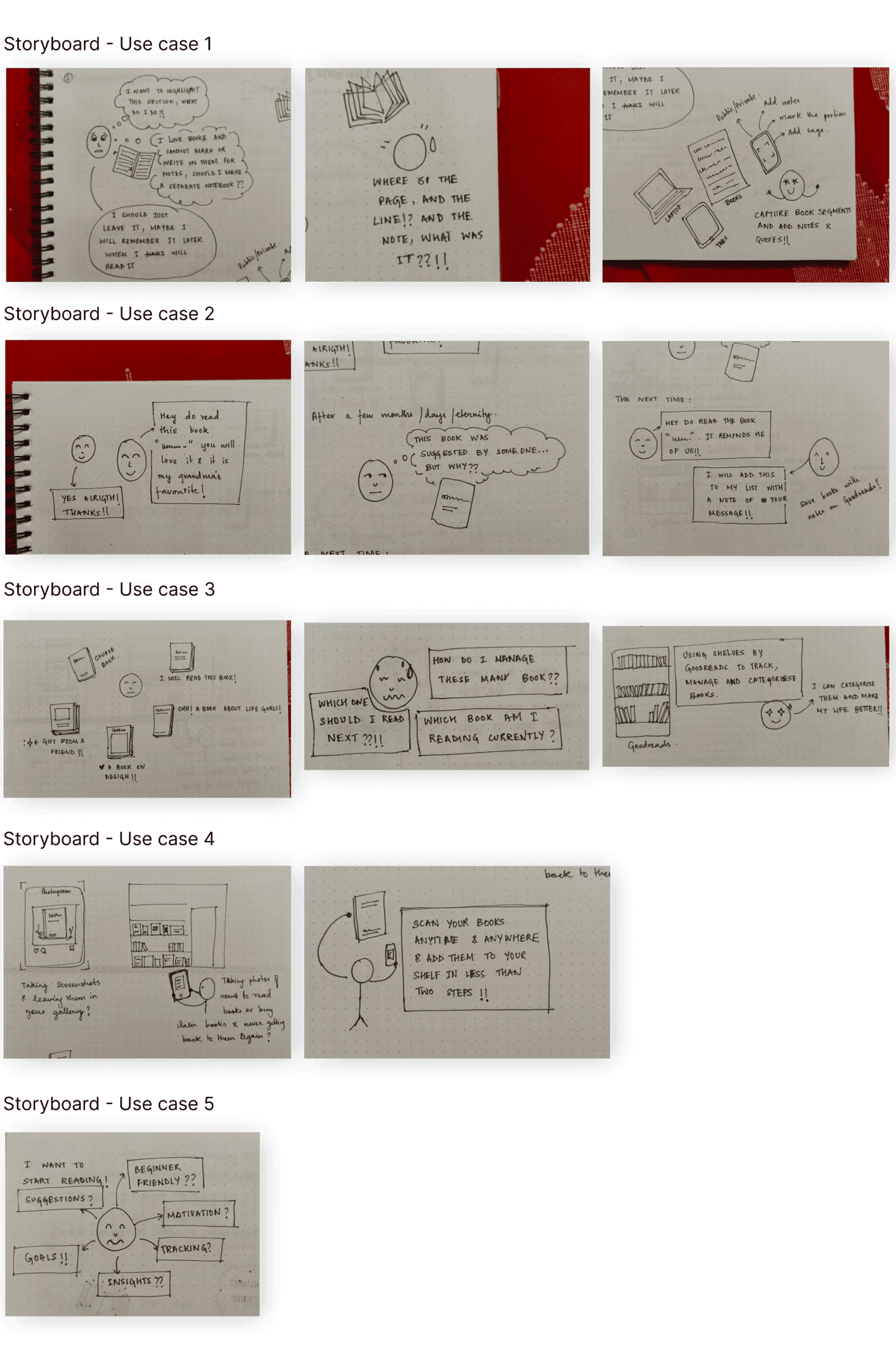
This is a completely new feature addition to the app for this project. The key takeaway of this feature is to provide users with better cataloging experience while reading a book. This was to fulfil its purpose on digital and traditional, both ways. This could collect all the documentation at one place, including from the ones in kindle, other devices or even real books.
Use cases: explained
Amazon's Kindle app provides a competitive edge, as it allows users to purchase and read books directly from Amazon's extensive library. Kindle's integration with Amazon's e-commerce platform and its large user base make it a strong competitor to Goodreads. While these competitors offer similar functionalities and features to Goodreads, each platform has its own unique approach to book discovery, community engagement, and user experience. Understanding these competitors can help Goodreads identify opportunities for improvement and innovation within the online book community space.
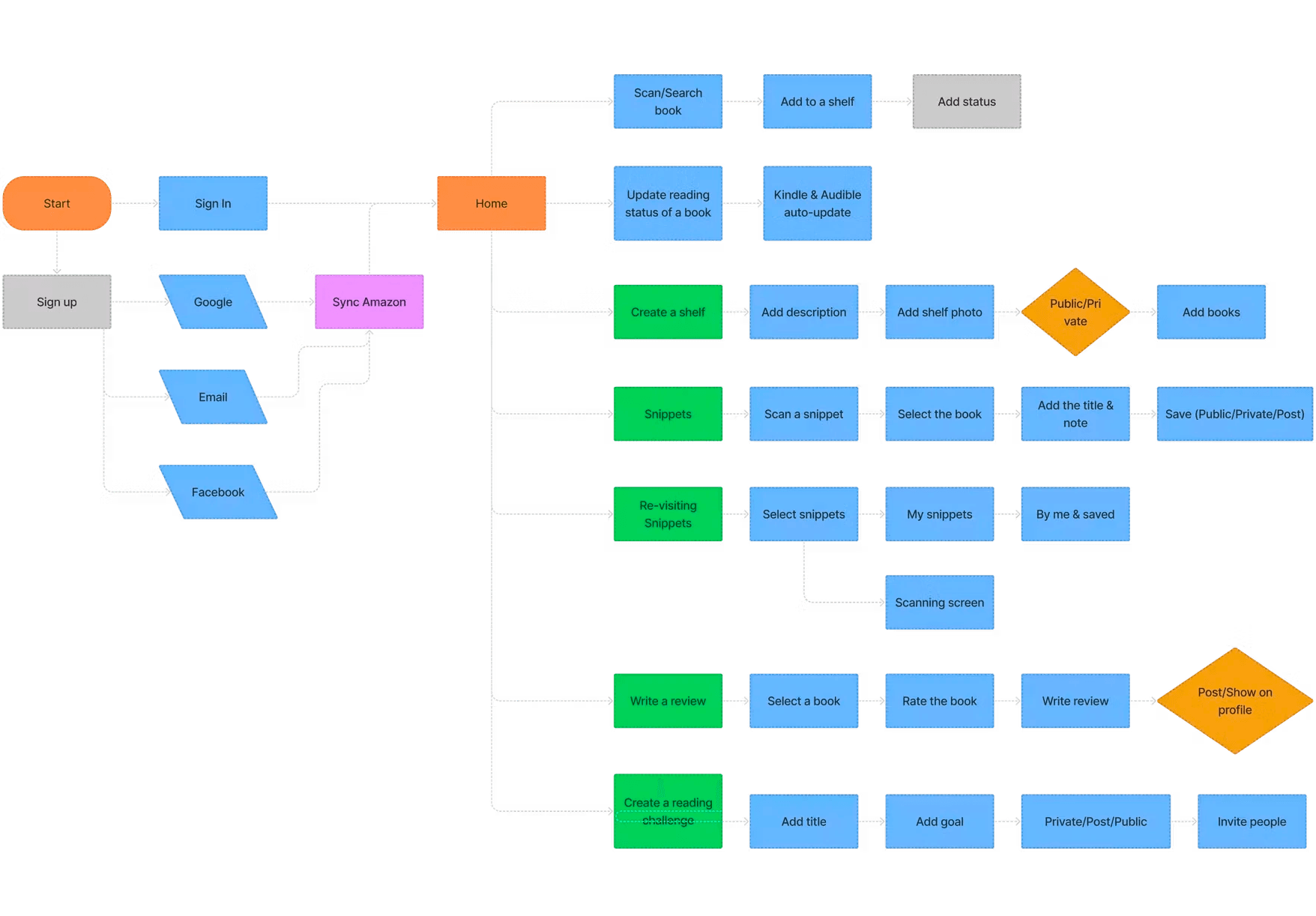
🔬 User flow
Keeping the skeleton we made earlier in mind, adding the new features user flow was designed. New steps like Amazon sync, shelves, snippets were added to the flow.
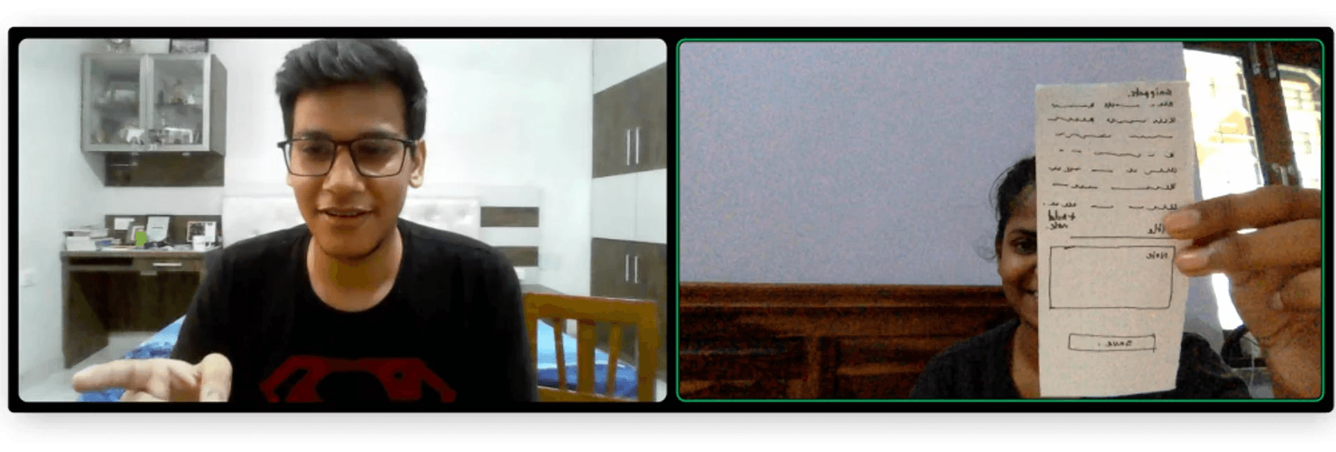
🪩 Lo-fi testings of new additions
New participants were chosen to conduct lo-fi testings. These involved changes in the new design features and trying out different iterations. Cataloging of books and creating snippets were new features to be designed from scratch hence it needed numerous iterations to go through.
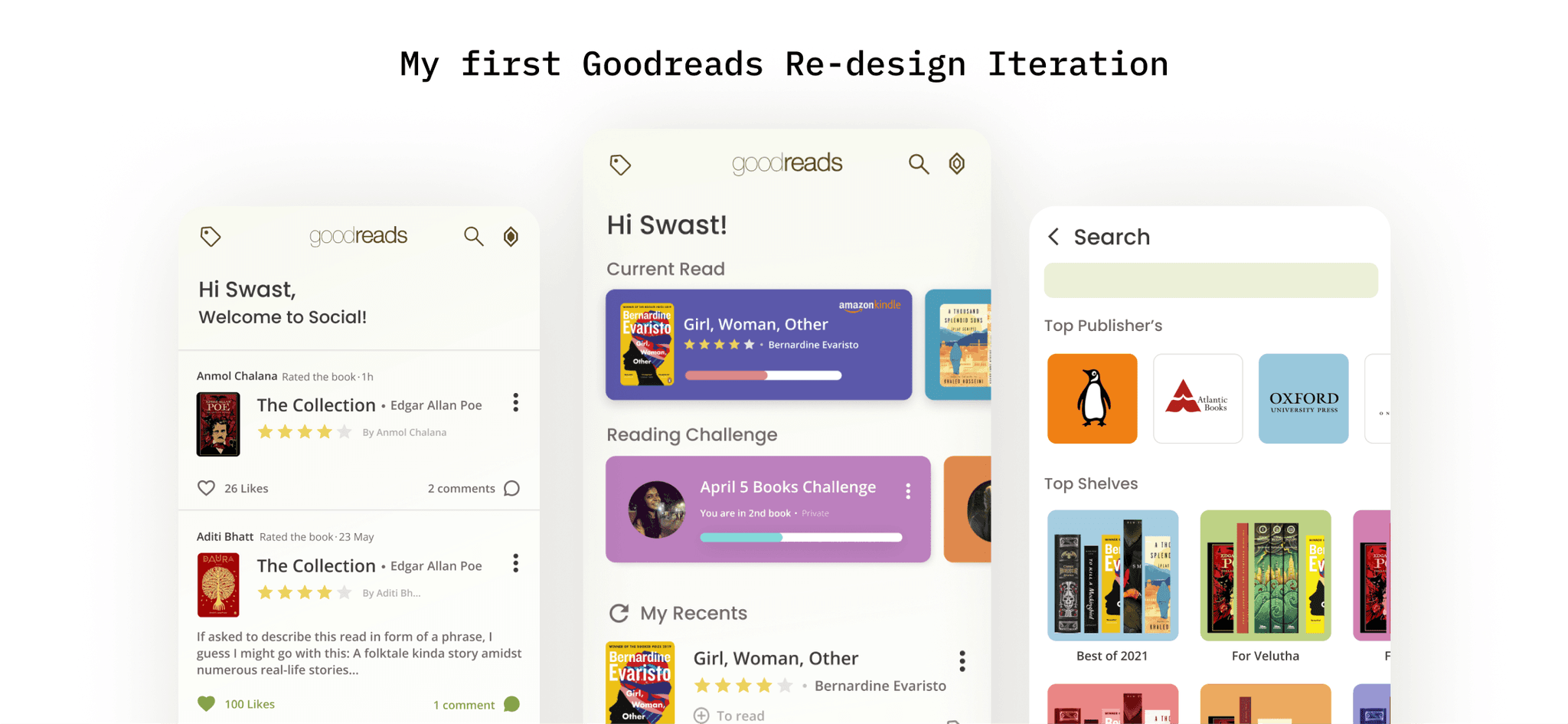
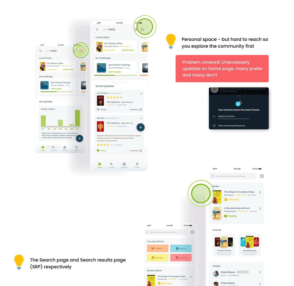
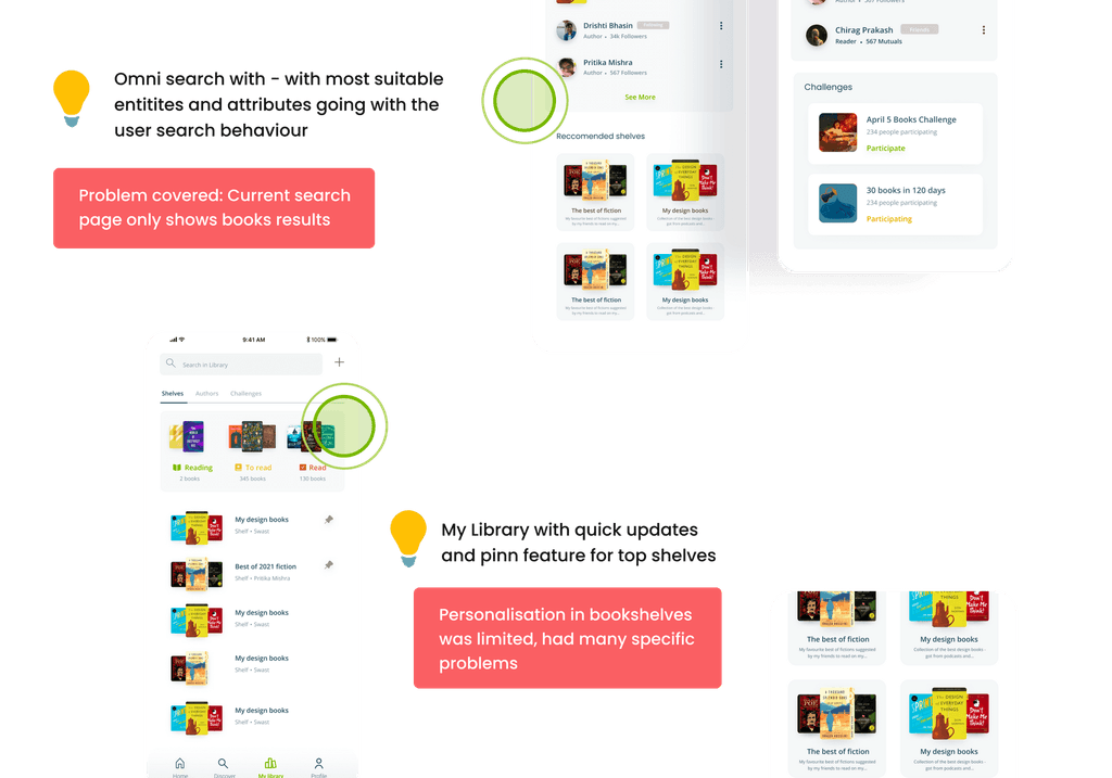
🔮 Final solution
Final screens with explained problems and their solutions is shown below. There are reasoning provided with each solution for why did I decide to go with that option.

🔮 Snippets: Final solution
End note
I believe design is an all time improving process which has no end! There is no definition of perfection in design but a scope to improve always. This project stands close to my heart as it was a continuous process of building, exploring and expanding which helped me learn a lot in design and interactions.